
How to Pitch a Website Redesign to a Local Business: One Opening Line for Each Failure
Most guides end at “make it personal.” Here is the sentence you actually type first — a different one for every failure a phone check turns up.
Nearly every piece of advice on how to pitch a website redesign ends at “personalise it”. Name something specific, stay brief, sell the value. All correct, and none of it helps when a plumber’s site is open on your phone and tapping the number does nothing. So what goes in that very first line?
This piece answers exactly that. If you have already given a prospect’s site a fast phone check — the five tests from how to tell if a website is outdated — then you are holding one or more failures plus a screenshot of each. What follows is a single opening line per failure, the version that backfires, and the four-part shape the rest of the note should take.
How to tell a business their website is bad without insulting them
No owner enjoys a stranger calling their website bad. They paid a firm for it, or a nephew put it together, or they built it themselves over a weekend. Call it dated and you have picked a fight about taste with someone who has already made up their mind they like it.
So skip the verdict. Report what a customer hit instead. “Your site looks old” is a judgement. “I tapped your phone number on my phone and nothing happened” is an event, one the owner can confirm in ten seconds. The first line opens a debate. The second opens a dialogue.
Three principles hold up every line that follows:
- Report the event, not the label. “I couldn’t read it without zooming,” never “it isn’t responsive.” Drop the jargon: no SSL, no viewport, no CMS.
- Frame the cost the way the owner would. A call that went unanswered, a booking lost, a shopper who moved to the next listing. Not rankings, not bounce rate — those are invisible from outside, and the owner knows it.
- Allow for being wrong. Every phone check throws the occasional false alarm. State what you saw, on which device, and hand them the out. That reads as careful rather than unsure — and it is honest.
The shape of a web design cold email that gets read
A first note to a local business owner has four parts, in this sequence. The whole thing fits on a single phone screen.
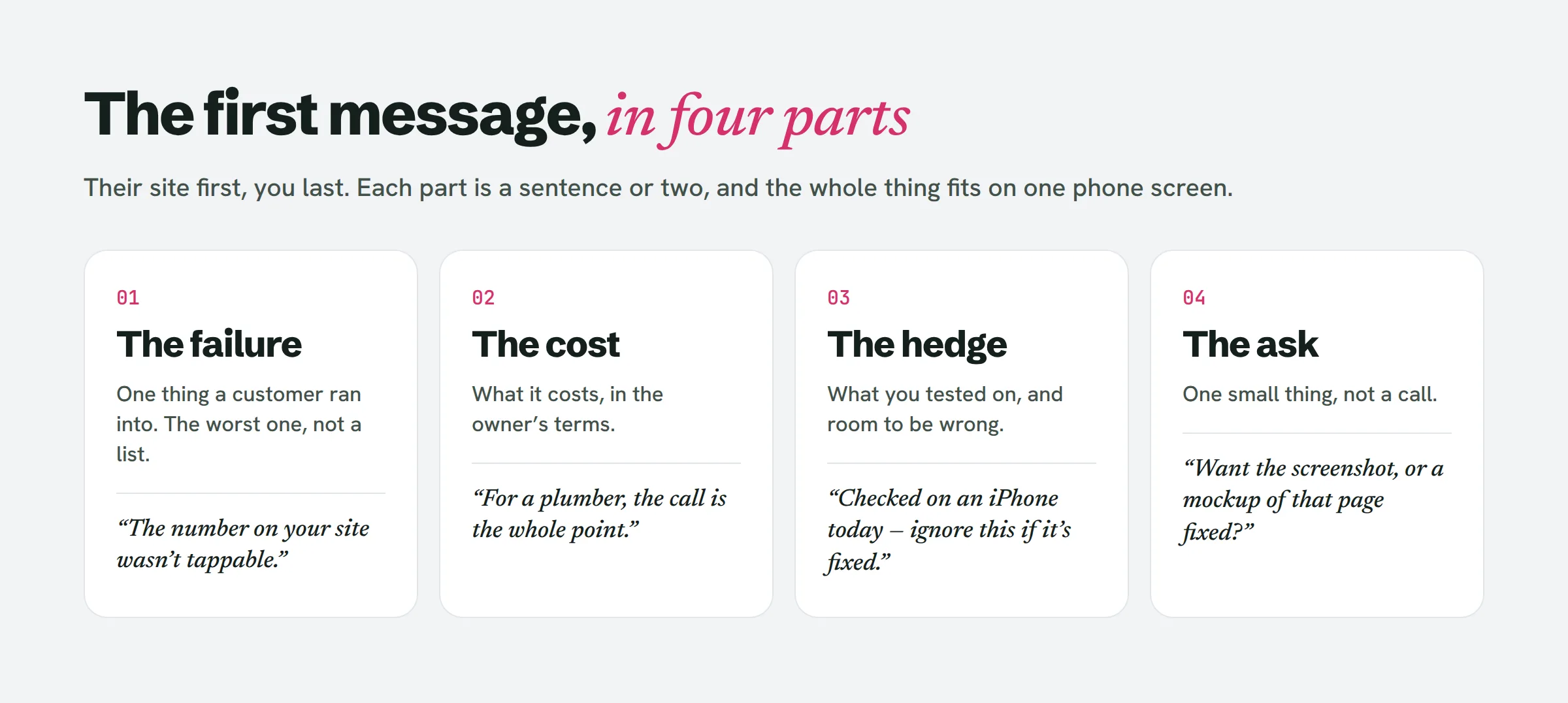
- The failure. A single thing a customer hit, in ordinary language. No list — just the worst one.
- The cost. One sentence naming what that failure is costing the business.
- The hedge. The setup you tested on, plus a line conceding it may already be sorted.
- The ask. One tiny request: may I send the screenshot, or a fast mockup of that page put right?
See what is left out: your name, your years in the trade, your portfolio link. All of that waits until the owner writes back. The email exists because of their site, so their site leads.
Five failures, five opening lines
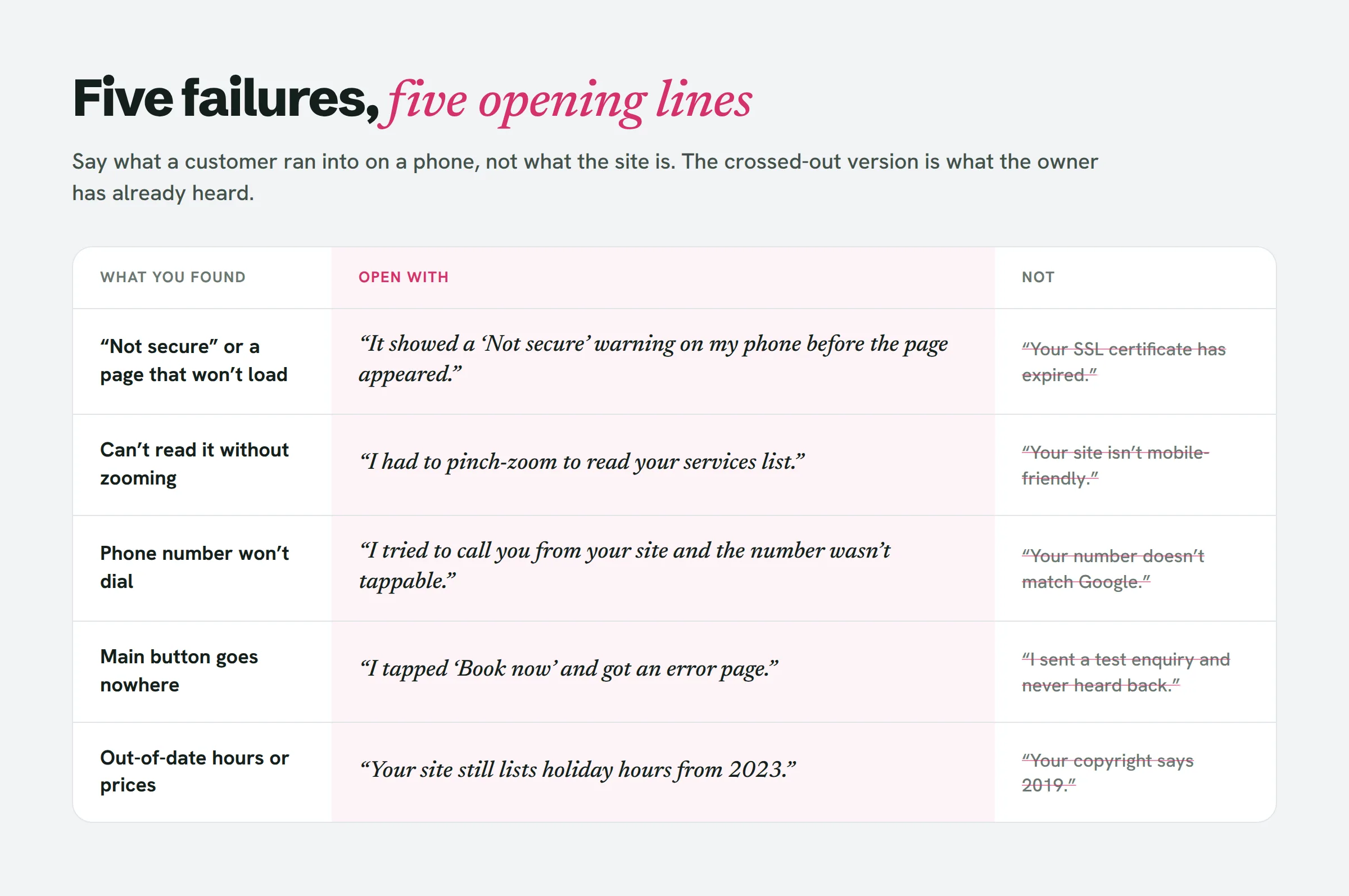
These line up one for one with the five phone checks. Grab the line that matches the failure you found, drop in the specifics, and stop there. Found two failures? Open with the costlier one — normally the phone number or the booking button — and hold the other back for the follow-up.
1 · “Not secure” or a page that won’t load
The line: “I pulled your site up on my phone this morning and a ‘Not secure’ warning flashed up before the page loaded. Plenty of people bail at that screen — all the more so on a page that asks them to hand over details.”
Don’t say: “Your SSL certificate has expired.” That is jargon, and it lands like a threat.
The hedge: if the problem was slowness rather than security, mention that you reloaded and it dragged both times. That clears the cold-server false alarm and proves you actually looked.
2 · Can’t read it without zooming
The line: “I had your site open on my phone and ended up pinch-zooming just to make out the services list. Most people hunting for a [trade] nearby are on a phone, and a good share of them won’t bother zooming — they’ll hit back.”
Don’t say: “Your site isn’t mobile-friendly.” Chances are the owner has viewed it on their own phone and reckons it looks fine. Describe the pinch, not the category.
3 · The phone number won’t dial
The line: “I went to ring you straight from your website on my phone, but the number wouldn’t tap through, so I had to type it out by hand. For most [trade] businesses the phone call is the entire point of the site.”
Don’t say: “The number on your site doesn’t match your Google listing.” Loads of businesses run a separate tracking number on purpose. A mismatch isn’t a failure. A number that won’t dial is.
Of the five, this is usually the sharpest line, because the cost writes itself. The owner can see the missed call in their head.
4 · The main button goes nowhere
The line: “I hit ‘Book now’ on your site and landed on an error page. Anyone who tried to book that way this week might be under the impression they’ve booked, or simply walked away.”
Don’t say: “I sent a test enquiry and never heard back.” Don’t fire fake enquiries at a real business, and don’t own up to it. Spotting the error on the form page is proof enough.
The hedge: “If most bookings come in by phone, this may hardly register — but the button is right there, so some people are relying on it.”
5 · Something a customer would act on is out of date
The line: “Your site is still showing holiday hours from 2023 and a price list that doesn’t line up with your Google listing. I only caught it because I was on the point of driving over.”
Don’t say: “Your copyright says 2019.” The footer year is the flimsiest signal on the list, and the owner is well aware nobody reads footers. Point instead at something a customer would act on — hours, prices, a menu, an event.
Once you have the screenshot, hand-writing one of these runs about five minutes per prospect. LeadReef writes this first email for you off the failure it flagged on each site, and you tweak the wording before anything leaves your outbox.
The screenshot is evidence, not decoration
The line gets the email opened. The screenshot is what makes it credible.
Grab it on the phone, right when the failure happens: the “Not secure” warning, the shrunken wall of text, the error page after the tap. Crop away your own notifications and battery bar. Skip the red circles and arrows — that reads like a teardown, and the failure shows up plainly on its own.
Whether you attach the image to the first message or save it for the reply is up to you. The point is that you have it and can fire it off in seconds. An owner who writes back “what do you mean?” and gets a screenshot within the minute is dealing with someone who genuinely looked.
What never to write in a redesign pitch
- “Your website is outdated / ugly / old.” That is taste, and you will lose the argument.
- “I noticed a few issues.” A few? Pick one. Vague reads exactly like generic.
- “Your competitors are killing you online.” You have no idea if that is true, and neither do they.
- A list of ten problems. It comes across as an audit nobody requested. One failure — the worst one.
- Traffic, ranking or conversion numbers. None of it is visible from outside. A guess wrecks the credibility the screenshot just bought you.
- “I’d love to hop on a quick call.” A 20-minute call is a heavy ask from a stranger. Offer to send one thing instead.
People also ask
How do I sell a website to a local business?
Open with a failure the owner can verify themselves, on the same device their customers use. Offer to send a screenshot or a mockup of that single page fixed. The selling happens once they reply, not in the opening email.
How to identify a bad website?
Load it on a phone over mobile data and attempt what a customer would: read the page, place a call, and tap the main button. When two of those break down, the site is losing the business customers.
What are common website red flags?
A “Not secure” warning, text too small to read without zooming, a phone number that won’t dial, a booking or contact button that throws an error, and hours or prices that have been wrong for years.
How to get customers for a web design business?
If you are a freelancer starting with no clients, the quickest path is usually local businesses whose sites break down visibly on a phone. Each one gives you the opening line of your pitch for free.
How much can I charge for a website redesign?
That turns on the trade, your market and the scope, and the first email is the wrong spot to quote a number. Land the reply first; set the price for the fix once you understand what the owner truly needs.
Where this fits in how to get web design clients
Opening lines are the tiniest slice of how to get web design clients, yet beginners pour the most time into them. A line only lands because of the work behind it. You singled out a business still trading, ran the phone check, turned up a genuine failure and captured it. Skip those steps and no phrasing will rescue the email.
Do the work, and the pitch nearly writes itself: what happened, what it costs, what you tested on, one small ask. Send ten of those this week rather than a hundred templates.
If you would rather have the list and the opening draft waiting before you begin, LeadReef gives you your first 10 leads completely free — choose from any of 10 business types and 10 locations, and every lead arrives with its failures flagged, contacts attached and a first email drafted. Paid plans unlock every business type worldwide, in any combination.